
Dark Side of The Moon is The Sound's number one greatest album of all time. The album isn't just a great album, it is also one of the most famous album covers of all time.
Designed by Aubrey Powell and Storm Thorgerson of Hipgnosis, the original design was born during their late night brainstorm sessions. They had limitless creative freedom as Pink Floyd gave them the bare minimal creative direction. Richard Wright suggested them to "do something clean, elegant and graphic".
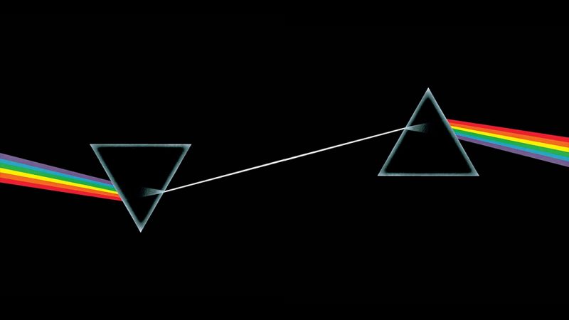
One night, Thorgerson presented a black and white photograph of the dispersion of light by a prism, a photo he saw in a physics textbook. Along with many other ideas, Hipgnosis presented the prism design to the band which was almost immediately approved by Pink Floyd.
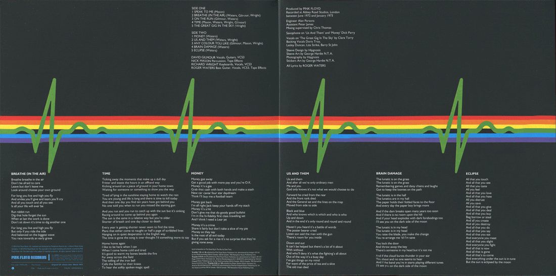
Roger Waters then suggested that the image should extend across the gatefold of the album cover and a heartbeat blip would be featured inside.
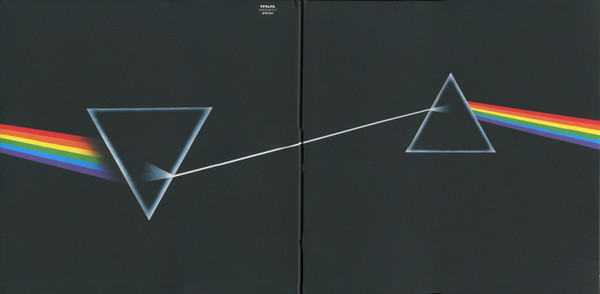
In an interview with Rolling Stone, Thorgerson stated that the prism idea was related mostly to Pink Floyd's light shows. "They hadn’t really celebrated their light show. That was one thing. The other thing was the triangle. I think the triangle, which is a symbol of thought and ambition, was very much a subject of Roger’s lyrics. So the triangle was a very a useful – as we know, obviously – was a very useful icon to deploy and making it into the prism – you know, the prism belonged to the Floyd."
Source: Medium